Accessibility
Color Blind Visitors
One in twelve men reads color differently: check contrast, never use color alone to carry meaning, and test the palette with a simulator.
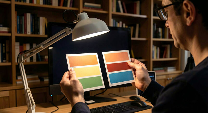
One man in twelve and one woman in two hundred read color differently. In a congregation of two hundred, that is a dozen members and visitors for whom the red and green of the church calendar, the tinted buttons of the giving page and the red text marking a changed service time do not say what the design team thinks they say. This guide explains the common types of color blindness, the contrast rules that serve everyone, and the small design discipline that keeps a church site readable for all of them.
Color blindness is not rarity or exotic need; it is the statistical certainty of any gathered church. The good news is that the fixes are cheap, visible to no one else, and they improve the site for the rest of the congregation at the same time.
What does color blindness actually look like?
The common forms reduce the distinction between red and green, in mild or strong versions, or between blue and yellow. A rarer form sees no color at all. What matters for a web team is not the diagnosis but the consequence: two colors the team sees as opposite can read as near identical. A calendar that marks the youth retreat in red and the elder's meeting in green has, for a dozen members, marked both in the same brown. The name of the condition changes nothing about the fix.
Why can't color carry the message alone?
The rule that solves nearly everything: color never carries meaning by itself. Every color signal needs a second cue, a shape, a label, an underline, an icon. A changed service time is not only red, it carries the word "changed". A required form field is not only a red border, it carries the word "required". Links inside body text are not only a different tint, they carry an underline. This second cue costs nothing visually and rescues every reader the tint would have lost, a principle the screen reader guide states from the other direction: meaning needs words.
What contrast rules should a church site follow?
Text contrast is measured as a ratio between text and background, and the accessibility standard sets the working thresholds: four and a half to one for normal text, three to one for large headings. Ratios below that fail not only members with color vision differences but anyone reading a phone in sunlight. The WebAIM contrast checker, a free tool any volunteer can use, takes two colors and returns the verdict in seconds; a team auditing its palette pastes in each pair from the site's stylesheet and marks the failures. This one afternoon of checking catches the majority of color problems a redesign would later have to unpick.
Which church design habits fail the ratio?
Three habits recur. Grey text on white, chosen because it "looks softer", often lands near three to one, below the threshold for body text. Burgundy on a stained glass photograph, the classic church aesthetic, fails unpredictably because the background shifts from pane to pane. And gold text, beloved on navy church sites, reads as a faint shimmer rather than words at small sizes. The design dos and don'ts already steer text onto solid backgrounds; the contrast discipline completes that advice with numbers instead of taste.
How does a calendar or chart stay readable?
Calendars, ministry schedules and giving charts are where color does the most work and fails the most members. The discipline: every category distinguished by color also carries a label, an icon or a pattern. A pie chart of the budget where each slice carries its percentage in text survives any reader; the same chart relying on six adjacent tints does not. Event calendars in church platforms usually offer category names by default, and the team's job is to keep those names visible rather than hiding them for visual calm.
What do the simulators show a team?
Free simulators, built into most browser developer tools and available as standalone sites, render a page as the main types of color blindness see it. Running the home page and the giving page through a simulator takes ten minutes and reliably surprises the team that has never done it: the bold red button disappears into the burgundy header, or the green "confirmed" message vanishes into the background. The simulation is approximate, but it is direction enough; where it shows a loss, the second cue belongs.
Doesn't this constrain the brand palette?
Less than teams fear. The palette survives; what changes is that color stops being the only signal and starts being one of two. The navy and gold identity keeps its navy and gold, while the gold retreats from body text into headings and accents above threshold. Deep reds stay for banners while timelines and tables gain their labels. Churches reworking a full identity can also read the shared principles in the accessibility section, where contrast serves low vision members and legibility serves the elders covered by the older members guide; the three audiences reward the same discipline.
Where does a team start on Monday?
Open the contrast checker, paste in the site's body text and background pair, then the link color, then the button text. Fix any pair below four and a half to one by darkening the text, not by shrinking the ambition of the design. Then walk the home page adding a second cue wherever color currently works alone: the changed times, the required fields, the link underlines. The whole pass is an evening's work, and it is the cheapest accessibility win available to any church site.